Mobile Website Development
Optimized Websites For Mobile Devices
Mobile Web Development
Responsive Web Design: The New Mobile
In the last few years, mobile web development has become more of a “yesterday” technology. Today, Responsive Web Design is replacing the need for mobile websites and as a result, it is unlikely that mobile web development will ever be as popular as it once was. Most experts, ourselves included, feel that within a few years, mobile web development will be a thing of the past. In the big scheme of things, we welcome this change away from mobile web development as Responsive Web Design is a much more robust solution.
Having said all that, we still do offer mobile web development services to clients that want or need it. If you are starting a new website or in the market for a website redesign, we suggest you take a look at Response Web Design.
Why a Mobile Site?
Mobile “Smart” Devices such as the iPhone, iPad, Windows Phone, Android, GalexyS, etc. now make up for a significant amount of total internet traffic. In fact, mobile devices now surpass computers as the primary source of internet browsing in the near future.
Customers use mobile devices to do everything from getting directions to your location, browsing your website, checking in, watching videos and even shopping.
Standard Sites VS Mobile Sites
While mobile devices are capable of displaying the majority of websites out there to some extent, having a specific mobile optimized website is ideal. Standard websites are made to fit big screens and use a lot of bandwidth. This often makes browsing a site on a smart phone or tablet difficult, expensive, and in many cases impossible.
A mobile optimized website ensures that your mobile audience can easily get the information they need from your site quickly and efficiently, without taking forever to download or draining their data plan.
Other Company’s Solutions
There are several services out there that offer mobile websites. Often these solutions require a separate website to be created, managed and maintained causing headaches in keeping your information synchronized and up to date across all of your websites. Others utilizes programming that sends visitors away from your website and directs them to another domain name. Still others will sell you mobile apps that require a different version app for each device and require the user to find, download, install, and run the app not to mention manually keep the app updated. All of these solutions are inefficient and a waste of time, resources and money.
Our Solution & How It Works
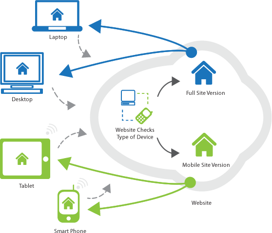
Our system integrates directly with your current website and our Content Management System (CMS). When a visitor enters your site, our software automatically detects what type of device the visitor is using and will deliver an optimized version formatted for their device. This happens seamlessly without redirects to other websites or domain names. Additionally, because our solution runs off your current website and CMS, your website and mobile site is always up to date with your content without the need to syndicate. Whatever you put on your standard website is instantly reflected on your mobile websites.
Features & Benefits
- Optimized Site:
Site is formatted to fit the user’s device. Simplified design, navigation and layout ensures that your mobile site is compatible with the widest range of devices possible. - Maintain One Website:
No need to make changes to multiple websites or worry about the content on all your sites being up to date and syndicated. Our system integrates into our CMS and instantly reflects any updates or changes you make to your site’s content. - Wide Range of Devices and Brands:
The mobile website solution is built from the ground up to work on a wide range of the most popular devices such as iPhone, iPad, Android, Windows, Blackberry. - Automatic Device Updates:
Software is automatically updated periodically to ensure that new devices are detected as they are introduced. - Switchable Mobile / Full Site Option:
Allows the visitor to decide if they want to continue to use the mobile site or the full site. Also provides a fall back to the standard full site for unrecognized devices ensuring everyone will be served content. - Customized Design:
Choose from several looks and layouts that incorporate your logo and color scheme. - Interactive Menus:
Several menu styles to choose from keeps your list of pages easily available for navigation. - Tap To Call:
Sets your phone numbers so mobile users can easily call you simply by tapping your number. - Interactive Maps:
Scroll, zoom and pan maps of your locations. - Interactive Driving Directions:
Get directions to your locations by entering an address or letting the website find the user’s current GPS location. - Mobile Optimized Forms:
Uses HTML5 to optimize forms so they are easily filled out with mobile devices. - Alternate / Optimized Mobile Media Content:
Integrates with equipped ASI:Toolbox utilities to provided optimized media content (video, images, etc) for use on mobile devices.
In our industry we always need to be on the cutting edge to show that our firm is updated with technology and the times. The mobile site that [Advertising Solutions, Inc] provided does just that.